Sunday, December 14, 2014

Sketchbook Project 2014-15 pages 10-17

             Again, more familiar stuff before. This is the time where I was created the characters for "The Desert Silhouettes", trying to give them a style or at least an identify for Deron and Farooq. When thinking of the Deron, I wished for him look much of his people but that edge that wanted exploration. And if you see that small note on page 11, I had the idea of having each human character (extras to important) they own symbol or icon. For example, Deron symbol is the swirl on his chin.
            Then when thinking of Farooq design, I knew that he would be the cute furry but some sort of lizard with the Disney's Beast's legs. Since his ability is camouflaged, it seem very unneeded for fur but rather something a skin that can hold onto particular surfaces. Overall, these were the first few sketches from this upcoming comic.    

Page 10-11 pencil

Page 12-13 pencil& watercolor
These two illustrations were actually specific ideas for promoting my venture crew. I was thinking of what representing those moments the most are around the camp fire, because it is the one place that is warm in the dam darkness while lots of stories/ advices can be told through. It was probably a bad idea about doing watercolor on this type of paper but the color pallet work excellently with theses illustrations.
Page 14-15 Watercolor 
Then these are fun little doodles that I got inspired off of when watching Nickelodeon's "Danny Phatom", which I do recommend for people who like the supernatural forces, high school stuff, great comedy and memorable characters. While one this topic, here is a link for people are interested in Danny Phantom graphic novel, a fan made comic with beautiful development of illustrating and interesting story plot that follows loosely along the origin plot: http://legendarydestination.featheredcritter.me/

Page 16-17 pencil

Saturday, December 13, 2014

Sketchbook Project 2014-15 pages 4-9

Page 4-5 pencil and ink
              These are quick observational doodles that I have done in pencil and ink. Mainly I was trying to draw dog bodies as well as people sitting around the campfire. There should have been more but it was drawn on a particular day so I left it alone for that. Maybe if I added a post it, it could have bought more color into the pages.

Page 6-7 pencil, pen& ink
          On these two and four pages, I was thinking a lot about my story "Tail", possibly continuing the story further into the college life perspective but also expanding the ocean fantasy folklore. So these are pretty much concept art for the mermaid soldiers to other sea dwellers could share the ocean floor as well walk.
Page 8-9 pencil, pen &ink
            These may look familiar from a long summer ago because they are. These were the page that I used to figure out the cover page or recognizable image for the Tails story Most were doodles that came out our my head and what my mind thought was.

Friday, December 12, 2014

Sketchbook Project 2014-15 pages Cover & 1-3

Hello Everyone, sorry for the delay but it has been difficult pushing time away when I was typing an class evaluation for creative writing and an eleven paged essay about how society is sympathizing with monsters than fearing them now. Not to mention my last final projects for Audio& Video, Typography and Illustration 1 all in one deadline. Anyways, I get to sleep in and get back to reteaching myself watercolor and gouache after all the pen & ink drawing. 

But I nearly forgot that I signed again for the Sketchbook Project of 2014-2015. I was able to scan it in then mail it off to its destination on time with some good sketches and doodles, which I will give a brief explanation about. Make sure you check out their website to see other inspiring sketchbooks people have submitted all over the United States at https://www.sketchbookproject.com/  


Cover of sketchbook

This is pretty much my first time decorating a sketchbook cover but what I learned in sketchbook club, there is nothing better than an interesting appearances for the readers to open your book. This was pretty much last minute but I wanted to do something colorful but with mix media. If you cannot tell, those are chocolate ball wrappers that I laid out abstractly from back to front. I also incorporated pen and ink sketching of bunny rabbits (honestly I don't know why except that it works with the movement of the foil).


page1 pencil
My first page was pretty much observational studies I drew the first day I got. To keep my life drawing skills I learned in the Spring semester, I was drawing or rendering people as much as I could. The one on top is my little sibling, lying on our brand new couch, who was willing to pose for me perfectly. The one below were a few weeks later, of my brother and his girlfriend also on the couch watching television (maybe the "The Croods" or "The Hobbit). They were more difficult since they were in motion on the couch, from cuddling to throwing pillow upon each other. Mostly it was rendering the back of their craniums or my brother's haircut that made hard to render.

page 2-3 pen& ink, pencil
Okay, so page 2 is a hit or a miss for the sketchbook. These are post it stamps that I drew on when I went to the musical of "Mary Poppins" in the summer. It is a lot more fun since it is colored paper and you have limited composition size to work with. Then page 3 is pretty much the thumb nail posters images that I came up with for the Secret of Monkey Island.

Friday, November 28, 2014

Happy Thanksgiving!!!


I do hope everyone had an excellent and safe Thanksgiving week. I want to thank all my relatives and my family that I got to send the few days with, eating and socializing with. All I hope that people were able to get through the traffic, snow storms, friday shopping and football games and "Now" we may celebrate the christmas commercials.

Sunday, November 23, 2014

Sculpture, Metal and 3-D Design Display

          Two more classes left before Thanksgiving break. I'm excited for food but bummed about the homework I have to bring back with me. Hopefully it won't pull me away too much or get messed up but who knows. Anyways, I don't have any finished work or sketches so here are the gallery of student work that exhibited on the second floor. It is pretty impressive on what people were thinking with the limited supply but it came out amazing. All these are a sample from Sculpture course, metal course and the foundation of 3-D Design. Makes me be inspired and hopefully pick up my wire sculpturing again over break or the end of the semester.


Friday, November 21, 2014

Guess the idiom and five second vid

                I feel like I did nothing today. I didn't get anything accomplished or finished because of everything else being thrown at me. Maybe it the big school Thanksgiving party coming up in the next three hours or just Friday has been uninspiring to me. Heck, today I was struggling for four hours just to start on a illustration, which I had to push off for the weekend. So, maybe to cheer myself up maybe begins posting a few of my video I created in my audio& film media course. So this is my five second film, very similar to the vine videos.


        So the illustration that I was doing was illustrating a particular idiom. These are a few of the idioms and you figure out which idiom they are. Check out this link to see a number of the idioms : http://www.idiomsite.com/


Friday, November 14, 2014

Is it really friday?

Again, it is coming too close to end this semester and time is loosing itself. When being attracted to my desk space and walking back and forth to classes, it is weird to get back on track when I get somewhat a break from my homework. All that I need to focus on is illustration, creative writing, English and film footage for one of the lectures. Very soon, I am excited for Thanksgiving or November events are coming up, where I can finally get some great large meals and homemade vegetables.

So this is the finish illustration of the large honey badger in Beverly, painted in watercolor and gouache with the new changes to the first sketch, adding more values and enlarging the image. I could say bough back what I enjoyed, having the energy I wanted to expressed in this scene.

Then I got to finish my open and close sign for typography 1. This project is pretty basic, that you are creating a sign themed off a shop. I chose to do a sewing or yarn store, making me have fun with decorating the typeface and using the theme to my advantage.


Sunday, November 9, 2014

Monster Attack on Bevelry

So here is the final sketch from tomorrow. We have a large honey badger climbing over one of the churches, with Robert Downey Jr. taking a selfie with the beast. Also, Honey Nut cheerios because . . uhhh. . . honey theme? Remember this was the cereal I bought so I can put whatever I want in the picture. The most challenging part was probably drawing Robert Downey Jr. Whether to render to perfectly draw someone recognizable isn't easy to do, since you are revealing to the general public. Not to mention, there is a lot of pressure to draw him perfectly :3 


Friday, November 7, 2014

Two Hours Reading & Update

          Pretty late for an update, just returned from watching "Joseph, Prince of Dreams" and "Prince of Egypt". It been a little tippy today, not to complicate, but I was walking against ice drilling winds just to shop at the food store.

          Still I am happy for this morning because my dear, lovely friend and I, headed off to the public library to read. Yes, we read for two to three of short stories and graphic novels. Registration and the thought of finals has been dragging on so we just need a break from it, just to distance ourselves from artwork. And this library is prefect, it so large and peaceful that I'm surprised no one hasn't been coming there. I remember last year I went there to check out Neil Gaiman's "American God" which was a great book so I might make it a regular thing, I hope.

           Okay, besides that, here is a quick update. For Film Audio Media, we just finished our abstraction footage, an overall demonstration of what we done with audio and video. What I concentrated with books and page textures, which were actually fun to play with. But now our next project is to make a five second movie. Yeah, five second video. You might have seen them to sum up movies or for comedy uses. Or, mainly popular as vine videos. I'm not sure what to go for but I might try comedy if I don't come up with something solid. For a idea, watch these videos to just a good laugh into your day: https://www.youtube.com/watch?v=saqO_ZqX6uY
 (Warning, R rating language to the viewers)


              Next, For Typography we are designing signage, mainly one for an open and close sign for a particular store. My theme is a sewing and knitting shop that close to my house, since I did like the color pallet and sweet tone to it. Even though their open signs were displayed with waving flags, I can still work as you see in their designs. With the use of thread and yarn strings keep the viewers's eyes focused on the words and hope to not be distracted by the lines.

             Currently, I am putting my quality time in my illustration homework known as the Scavenger hunt. Here's the assignment and I'll let you draw your own conclusion:

"There has been a terrible accident at a nearly nuclear power plant! An exotic animal from a local zoo took in a large dose of radiation and has somehow grown to a gigantic size! The huge animal is shocking people all over the Montserrat area including a living, famous person who happened to be in town! The authorities has yet to be notified, so the giant beast is a surprise to everyone that crossed its path! It's shocking!"

So yeah this illustration is a narration of a large animal interacting with the town's environment, celebrity and an store product. What I have been thing strongly about is the animal is a Honey Badger :3 yes, a honey badger. How pretty work it be, for real life. Then the person witnessing it would be Robert Downey Jr, of course. I would have him scared him but from we all learned from his characteristics, he is much to lay back from that. So an idea was to identify him as Iron Man as he is confronting the creature. Another thought was having him in the foreground, taking a selfie with the creature in the background. I don't know but it was just something he might have done. Then for the object, was going to do a cereal box of Honey Nut cheerios. Why, umm. . .  I recently bought some boxes of cereals and I have to use them in someway. Also they are the only thing in my cabinet that stand out the most. 
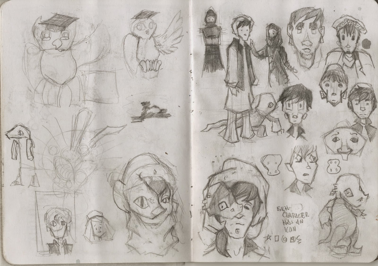
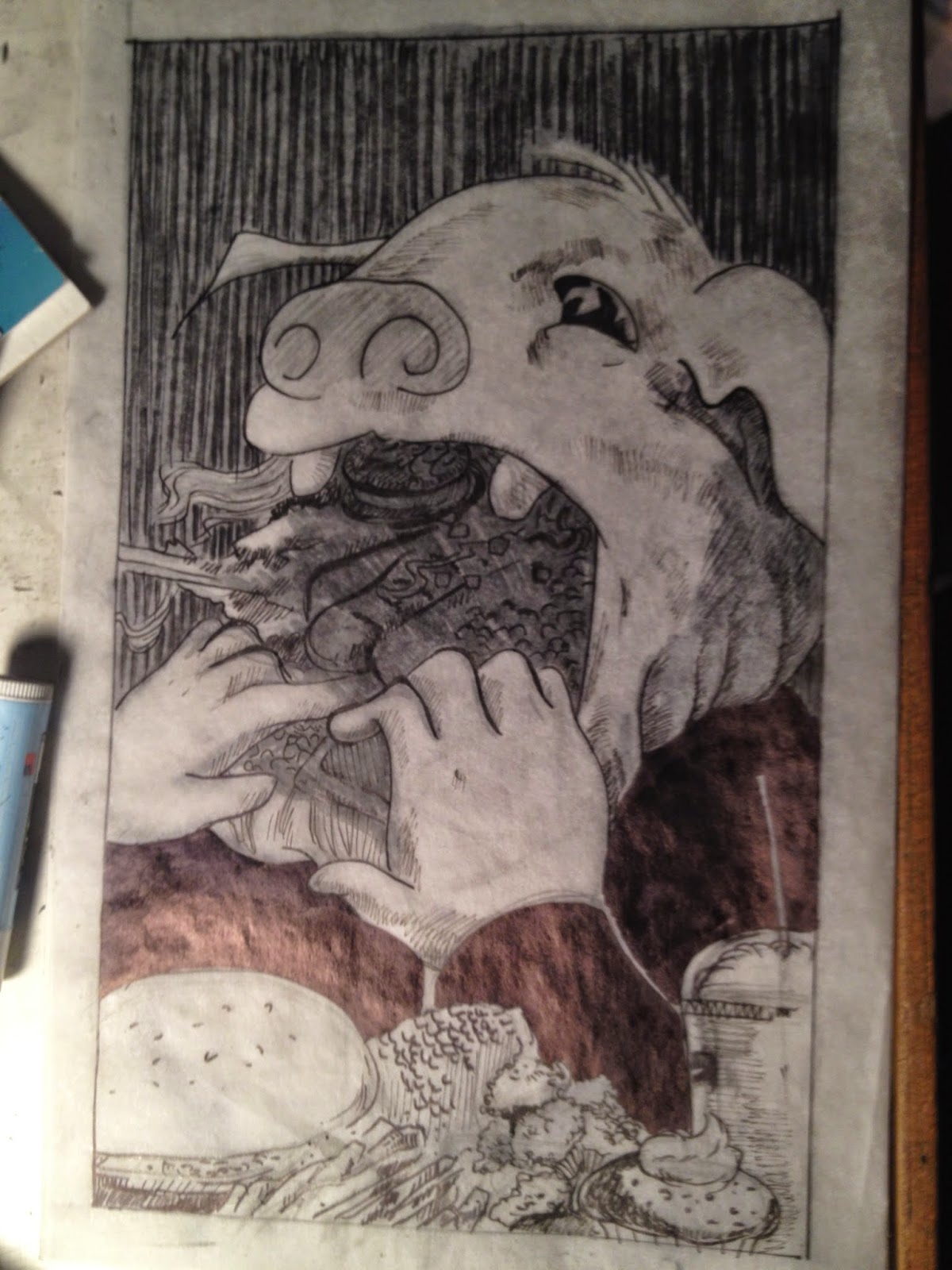
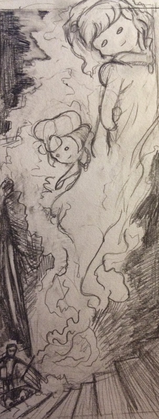
Anyways here are my studies sketches that I done so far :)   


Saturday, November 1, 2014

Happy Halloween :P

Illustration of Mary Shelley's Frankstein's Creature

Studies of OutLast's Chris Walker

Also, I add a new page titled "Comics", There I put a sample of my comic work and graphic novel pages for people to look at. Currently, I put in my finished Illustration homework to check out. I won't have a schedule to when I'll be updating the page, it will be at random points of time until further notice. 

Sunday, October 26, 2014

Revisiting friday post

Hey, if you saw Friday's post, I just put some pictures of an illustration and printed posters. I didn't get time to put out a description because my school was hosting another halloween party but it was this week instead of that Halloween week. I have no reason why they chose the 25th but who knows, it was a nice break from all my homework and the pouring rain for days.

Anyways first picture were practice pieces for Typography 1. For his project, we had to do research on a particular typeface and create two specimen posters for that typeface. The typeface that I was assigned to was Bodoni, created by the Italy designer Giambattista Bodoni in 1798. The influence of the typeface was inspired off of Baskerville and Didot typeface, combining thin hairline strokes to thick bold strokes to contrast with. The two bottom ones were suppose to be the posters with all the information about Giambattista Bodoni and his font. The three on top were posters that would show off the typeface itself in an artistic way. When printing these out there was an accidental mistake on the colored on top because it only printed the center of the composition. It actually worked out for me because it is appealing to the viewer's eye with the interesting negative & positive space with the typeface Bodoni in play.

Then the illustration below is the Mysterious slime illustration done in black watercolor and gouache. It was very difficult to render the texture of the slime because I'm not even sure what it should be. But after a while, I just though of any sort of slime and long wet hair. I had to make a couple changes from my original sketch like illustrating more stuff in the environment to make it more relatable, adjust the light source and making hint of a narrative.

So what I have been working on is mainly another illustration, a sequel comic. The theme for this comic is escaping from something, danger, stress, or something symbolic. So I decide to do something from the Halloween spirit but also something that fascinated me in England. When visit the Tower of London, which took an entire day, I visited one of their towers titled "Bloody Tower". It got it name from the disappearances and murder of the two princes. Twelve-year old Prince Edward V and ten-year old Prince Richard of Shrewsbury were declared to be next to the throne until their disappearances that made Richard the third the heir to the throne. It is likely that King Richard was their murder, and it didn't take long before their skeleton bodies were found in the tower in 1674.
So what I wanted to do was having their spirits escape from their skeletons so they can leave the tower and move on. Mainly I want to be vivid with the environments while simplifying the characters designs. I don't means to make the ghosts cute like chibi or casper but I just don't what the comic to be so details to not see at all. I'll post on Halloween day the comic and other illustrations possibly.